Data Visualization & Analy/ Covid-19 / Nepal
What I found visualizing Covid-19 in Nepal?
An exploratory analysis on Covid19 in Nepal

The spread of novel coronavirus SARS-COV-2, also known as Covid-19 prompted significant loss of human life all around the globe. Recently, covid19 cases skyrocketed in Nepal bringing more than 90% of the country’s population into lockdown. There are more questions than answers regarding how, when, and what went wrong for the massive increase in the number of covid cases. Utilizing my time in lockdown, I tried to find answers to some of those questions.
Visualization techniques have become a frontline medium to communicate data with the global audience. I collected various datasets, cleaned them, and combined them to prepare visualization for the analysis. This article is based on data up to May 31, 2021. Here are the datasets that came in handy for the visualization & analysis which I will be presenting.
- Coronavirus dataset from Our World in Data
- Mobility dataset from Google Mobility Report
- Recovery dataset from Johns Hopkins University
- Vaccine data from Our World in Data
Total Cases vs Total Tests

The difference between total tests and total cases seems to be very big, with more than 3 million tests and 550 thousand cases. This shows around 18% of the total tests are found positive in Nepal.
When Test falls, Cases fall with them

We can see two noticeable dips in the number of new cases i.e on October 27 & November 17. And the same day, there seems to be a similar fall in the number of new tests. The above area chart shows a very high correlation between new tests and new cases.
Consequences of Love
It’s beautiful to meet a soul who makes you forget Covid-19.

Mobility in the residential area reached an all-time high on March 29. This was during the first lockdown of 2020 when there were only 5 covid cases recorded in Nepal. After 11 months, on Valentine’s Day — February 14, 2021, mobility in the residential area fell back to baseline ‘0’ (what it used to be before covid19). More than 100 new cases were reported that day. Soon the mobility in the residential area moved up again with the lockdown of 2021.
New Year Effect
When new hopes are in order, your excitement level increases. And if it reaches the height of overexcitement, it can ruin your plans.
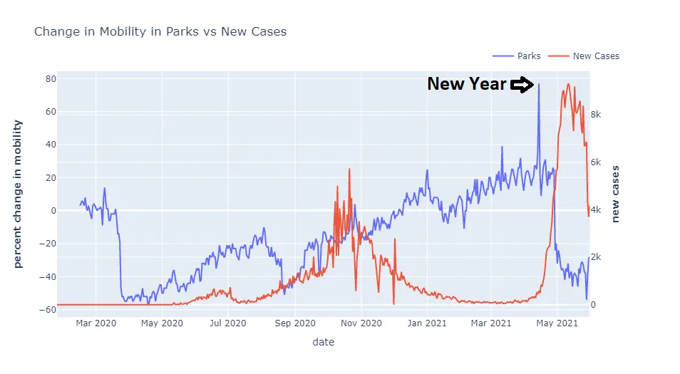
As shown by the graph, mobility in the parks peaked i.e. 77% above baseline, on April 14, 2021. As per Nepali Calender, this was a New Year and there was a public holiday for the celebration. In the first four days of the new year, around 2700 new covid cases were reported. There were around 3900 new cases in the next three days, totaling new cases to 6600 for the first week. In the second week, we got more than 20,000 new cases. Various local governments started issuing lockdowns and more than 90% of the country’s population was in lockdown by the end of third week.
Homecoming

A lot of people come to Kathmandu for Job opportunities and in search of better education. After the government announced lockdown in Kathmandu Valley, mobility in transit areas reached a record high: 56% above baseline. This massive increase in mobility in transit areas shows people returning to their villages to survive the fight against covid-19.
In the first (2020) lockdown, mobility was decreased by 73% but in this (2021) lockdown, mobility was decreased by only 64%, even though cases and deaths both were higher this time. This shows that the first lockdown was much strict and people were more afraid in comparison with the second one.
Panic Buying

Panic buying occurs when mass purchasing occurs in fear of missing or not being able to buy that product in near future. In the above graph, we can see the mobility around the grocery & pharmacy area was 45% above baseline on April 24. After the lockdown was announced, mobility around grocery & pharmacy went up by 80% and reached 81% above baseline on April 28. This ride took bearish mode on April 29 when the lockdown started.
Monthly Report
In the past 414 days, there were 159 days when the daily recovery cases were more than the daily new cases. Here, I have presented the monthly view of the data.

We can see in most of the months, cases are higher than recovery. This could also be because of slow recovery. Slow recovery or less recovery could be the reason for the scarcity of essential resources like oxygen and ventilators.
Good News!
Finally, there is good news that we will get rid of covid-19 soon. Various vaccines against covid19 have been developed. The government has launched a vaccination campaign. Your vaccination is fully completed only after you take the second dose of the covid19 vaccine. Below is an area graph visualizing the vaccination situation in Nepal.

“The secret of change is to focus all of your energy, not on fighting the old, but on building the new.” — Socrates
